Penguin Refresh Tool
March 4, 2016 — By Dr. PeteIt's been over a year since the last major Google Penguin algorithm update, and the next update is nowhere in sight. Are you tired of waiting for Google to refresh Penguin? Click the button below:

What I Learned About Marketing by Being Quarantined at the San Jose Marriott
March 4, 2015 — By Dr. PeteAfter waking up with pink-eye the day after arriving at SMX West, I'm on my second day of quarantine. Having exhausted most of the reasonable hotel TV options, I made the mistake of watching the Marriott channel on a loop. After a while, the marketer in me just couldn't take it anymore, and so this is my point-by-point response to the "Travel Brilliantly" campaign.
This is not a hotel. It's an idea.
Ok, but it's also a hotel, right? I'm not paying $209 a night for an idea, because I've got plenty of ideas.
That travel should be brilliant.
Technically, travel, as an abstract concept, doesn't have measurable intelligence, but I'm gonna let this one slide.
A promise that space is as expansive as your imagination.
I don't know, I can imagine quite a bit. Are you talking about outer space? I'm not sure what outer space has to do with my hotel choices, but sure, it's pretty big.
Offering surprises that will change as often as you do.
So, about once a day? What if I just throw on a sweater for dinner? Does that count as "changing"?
Don't surprise me too early, because I don't handle that well. I don't want some concierge shouting "boo" just as I'm getting out of the elevator with hot coffee. Honestly, I'm not sure why I want this at all, let alone daily.
This is not four walls. It's reinvention that will open your mind.
Well, my room does have a hallway, so it's got like seven walls, depending on how you count.
Innovation that makes checking in as easy as a check-out.
I haven't checked out yet, so I'll hold out for more data.
And room to breathe.
Average human lung capacity is about six liters, and that's like 1/5 of a cubic foot. I'm not sure this is something to brag about. I could put my head in my backpack and technically have room to breathe.
This is not business as usual. It's a new way to inspire, create, connect, and yes, dream.
I'm on six prescription medications in a strange bed, so it's definitely a new way to dream – I'll give you this one. I'm not sure how being chased by man-eating chocolate Zingers across the forest moon of Endor is a net positive, but it is a new way to dream.
We're on a journey to make your travels uncomplicated. Unforgettable. Brilliant.
Cool – let us know when you arrive. I'm on a journey to watch as many episodes of Spongebob in a row as possible while making hats out of Kit Kat wrappers. We're all on a journey, man.
Because it's not only about where you're staying. It's about where you're going.
Are you going to follow me around town and ask to carry my bags? Are you going to pop into the bar and say "Um, I couldn't help but notice you're drinking here when we have a free happy hour from 5:00-5:08pm." I'm sorry, but this is just gonna get weird for me. How about you stay inside the hotel, keep an eye on things for me, and maybe I'll call you?
How I Did 50,000 Push-ups
February 23, 2015 — By Dr. PeteLike all great terrible ideas, this one began with a bet. At the end of 2011, I was chatting with some folks in the Impossible League about year-long challenges, and a collective thought formed – What if we did 100 push-ups a day (or "press-ups", as my British friends call them), every day, in 2012? For reasons I can't recall (that I assume involved liquor), I had the bright idea of just "rounding it up" to 50,000. This would, we all agreed, be epic.
Then sobriety kicked in, and I did the math.
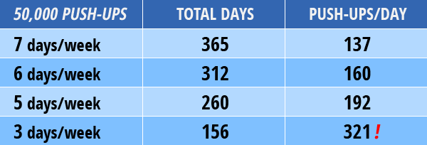
What Have I Done?!
I may have panicked... a little. Then, I took a deep breath, and I made two decisions. First, I would attempt to stick to a 6 day/week schedule. Second, no one said (or even remotely expected) that I'd be doing this in one set per workout. So, what if I ran those numbers out?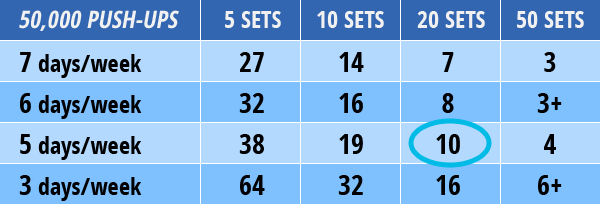
It Wasn't About Fitness
Running the numbers was a wake-up call, and led to probably the most important realization about fitness goals I've ever had – it's almost never about fitness, it's about commitment. I could easily do 3 push-ups in a set. If I was willing to do that 50 times a day, 7 days a week, I could do 50,000 push-ups. Sure, that wouldn't be easy, convenient, or fun, but it was physically possible. The trick was to pick a number I could live with and commit to it.Within a couple of months I was doing sets of 20+ regularly, and late in the year I could do 5 sets of 40 and top my daily goal easily. On March 16th, I clocked my first 1,000 push-up day, something I never would've dreamed was possible for me. On December 20, 2012, I did my 50,000th push-up. That same day, I finished my secondary goal of 25,000 sit-ups.
What I Think I Learned
An astute reader may notice that all of these events happened in 2012, and I'm writing this in 2015. Honestly, I keep hoping to find the one ultimate lesson in all of this that will magically inspire, but time has taught me that it's just not there. The truth is that I did the work.Objectively, this wasn't a very balanced workout. I pushed too hard, especially in March (when I took on a 30-day push-up challenge on Fitocracy), and I'm lucky I didn't end up with a serious shoulder injury. I eased up after that, and tried to learn my lesson.
On the other hand, I got stronger – the entire year. It was real, functional strength (I could tell when I picked up my daughter, who turned two that year), and it didn't plateau. Dozens of people told me at the beginning of the year why this workout was a bad idea, and maybe it was, but not for any of the reasons they gave me. People have a lot of strong opinions about exercise, and 95% of what you'll hear from 95% of people is just that – opinions.
In retrospect, the workout didn't matter that much. Sticking to a big goal for an entire year changed my outlook on just about everything I do. In October 2013, I finished my first marathon (5:13:39 – not spectacular, but hardly embarrassing), something I had talked about for years and never made the commitment to do.
I think now in big, year-long goals, and when I doubt I'm capable, I always look back on those 50,000 push-ups. It didn't have to be push-ups – really, it didn't matter. What mattered was finishing something I never seriously believed was possible.
Be Like Google: The Magic of Kerning
June 2, 2014 — By Dr. PeteLast week, a brave Reddit thread uncovered a shocking discovery. Google had secretly redesigned their logo, probably in the dark of night. The following GIF (via Gizmodo) reveals the radical transformation:
![]()
Naturally, it occurred to me – why not use this kerning to benefit other brands? Unlike the Highlander, there can be more than one.
International Kerning Machines
If anyone needs an overhaul, it's Big Blue – IBM's logo has remained mostly untouched for decades. Let's put kerning to work:![]()
When It Absolutely Has to Be Kerned
Whenever some designer wants to sound important, they trot out the FedEx logo and talk about "negative space" and a bunch of other made-up-sounding stuff. Let's get our kern on with FedEx:![]()
Life Happens Over Kerning
Who says kerning has to be restricted to letters? Not me, because I barely know what "kerning" actually means. Let's stop playing by their rules, whoever they are. Dr. Frankenstein didn't play by their rules, and that turned out fi... ok, maybe not actually "fine," but he did get a movie deal out of it, so that's cool.Anyway, let's see what kerning does to Starbucks recent redesign:
![]()
The Confidence Cycle
May 19, 2014 — By Dr. PeteI recently had a minimalist revelation – I was thinking about all of the advice floating around about success, and I realized I could distill a lot of it into just one diagram, thoughtfully saving you a few bucks on self-help books. I call it "The Confidence Cycle":
Sounds easy, right? Of course, we all know that there's a gaping chasm between bumper-sticker wisdom and actually achieving momentum in our lives. Maybe if we could just jump into the cycle after some other hamster had already put the wheel in motion, life would be easier, but each of us is the hamster of our own lives. Ok, that's probably not going to catch on.
Fortunately, my revelation had a part two, and not like a Ghostbusters 2 part two, but a serious Empire Strikes Back kind of sequel. I realized that we can jump into this cycle at any point, and each point corresponds to a popular piece of motivational advice.
I. Fake It 'Til You Make It
Pardon a whole mess of clichés, but confidence really is a state of mind. You can't really fake taking action or being successful, but you can act as if you were confident...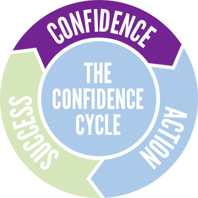
I suspect that this advice is just badly worded. What if you simply imagined confidence? What does it feel like? How would it frame your perceptions of your current situation? How might you do things differently if you were confident? Think of a person who you believe is confident – what would they do in your situation?
II. Just Do It!
I sincerely regret going all Nike on you, but there really is no better way to put this advice – sometimes, the best thing you can do is to take action, even if you're not really feeling it...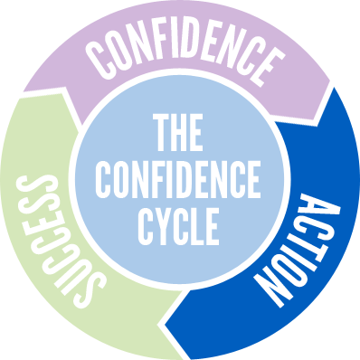
I know where your head's spinning, because I've set this trap for myself many times – what about the risks? Failure isn't free, and we humans can be a risk-averse bunch. It's a fair question.
Back in college, I got to hear Dr. Martin Seligman, one of the fathers of positive psychology, speak. In his keynote, Seligman admitted that he was, at heart, a pessimist. As someone who has studied and promoted optimism for years, Seligman's confession really got my attention, and his advice stuck with me.
Essentially, he said this: be risk-averse when the risks are real and high. If you're going to jump off a cliff with homemade wings or buy a house with 0% down the day before your boss wants to "have a word with you," then maybe you should think twice.
The rest of the time, though – and, realistically, the rest of the time is most of life – be an optimist. Many of our risks are imagined. The core problem is that the fear we feel, the fundamental fight-or-flight response, is the same whether we're about to speak in front of an audience or are being chased by a hungry bear. We have it in our power to rationally know the difference, but that's a choice we all have to make. The fear is real, but its power isn't.
III. Celebrate Your Victories
So, how you do you jump straight to success? It's not quite as easy as that, but there are two practices we can cultivate: (1) visualize success, and (2) celebrate your successes...
Success isn't just an objective state – a lot of it is about perception. Take the time to stop and recognize your own victories – willfully frame them as successes, and stop putting yourself down for a moment. Sometimes, that's all it takes to move the wheel.
And Will You Succeed?
To quote the late, great Dr. Seuss: "Ninety-eight and three-quarters percent guaranteed!" Yeah, maybe the good doctor was a bit optimistic with that number. Failure is inevitable. It seems like we're obsessed with it lately – either failure is "not an option" or we have to embrace it to the point of madness.I try to be more pragmatic. Failure is a setback, but it rarely comes without some form of lesson. Action almost always requires growth, regardless of the outcome. Action also leads to discovery, and sometimes you find the right path by ruling out all of the wrong ones. If that requires failure, and failure isn't deadly, then I guess failure is the price of admission.
Guess What? Jeans, That's What!
May 5, 2014 — By Dr. PeteSince 1981, Guess Jeans has been challenging us to guess something, presumably related to jeans. As someone old enough to remember 1981, I can tell you that having the Guess logo emblazoned on you was terribly important. I just don't recall why, exactly. Like I said, I'm old. Cut me some slack.
Guess' current logo is just about the opposite of minimalism:
![]()
Not Enough Guessing!
Beyond the Illuminati aspect (what is the mysterious triangle of 1201/1203, and what happened to 1202?), there's just not enough actual guessing in the Guess logo. They're Guess, and they sell washed jeans (unlike those dirty, dirty pants their competitors try to pawn off on us).So, let's strip this down a bit to a couple of key components – the name and the iconic question mark:


I've intentionally dropped the triangle on the question mark, because it's super-dumb. I could back this up with dozens of academic papers, except that my cat ate them.
It's Still Too Obvious
Except for the handful of people who might get confused because this kind of spells out "Gus" (Who is this mysterious Gus, and why are his jeans so clean?), it still feels a bit too obvious. If we marketers hate anything, it's clear messaging about our products. Let's go all the way...
Bonus Illuminati Edition
This whole 1201/1203 thing is still really bothering me #150; not enough to actually look it up, but hey, I'm a busy person. If you need your mysteries shrouded in secrets and cloaked in controversy, then here's a version just for you: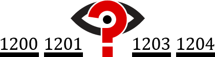
JC Superstar: JCP Reimagined
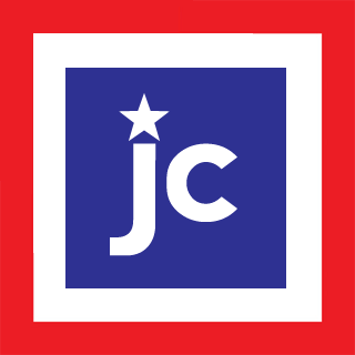
April 21, 2014 — By Dr. PeteBack in 2012, JCPenney's (former) CEO made a dramatic shift toward rebranding the company as "jcp" and took a bold step toward minimalism on behalf of God-fearing Americans everywhere:
![]()
![]()
Nothing Costs a Penney!
My core problem with the un-rebranding is that the original move to "jcp" just makes sense. I've been to the store, and literally nothing costs a penny. Now, you may be thinking: "Wait, isn't Penney some guy's last name?" I understand your confusion, so let's review the facts.You have to remember that JCPenney was founded during the gold rush to sell comfortable-but-durable St. John's Bay® polo shirts to miners. In those old-timey days, they added e's to everything. Old was "olde", a penny was a "penney", and the letter Y was spelled "ye", as in "ye olde penney" (which literally translates to "Why, old penny?"). When the Great Depression arrived and the cost of vowels skyrocketed, this spelling convention fell into disuse.
Here's my question – why include the "p" at all? It's time to take this all the way and just be "jc". It doesn't hurt that a certain deity's only child conveniently shares those initials. Look, I'm not saying that Jesus actually shops at JCPenney, but if people choose to believe that, who are we to argue?
Un-un-reimagining JC
Maybe the whole American flag part is a little too obvious. Plus, that big white space in the middle just doesn't work for me. Let's weave our national pride into the brand a bit more subtlely. How about we abstract it a touch more:
Aye Aye, Captain!
Let's lose the rectangular flag notion altogether and take this to its natural conclusion. First, we'll convert it to concentric circles: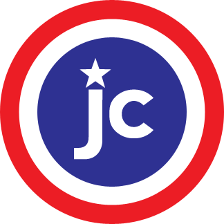
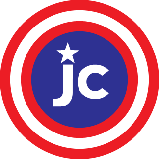
You're welcome, JC. Just remember: with great logos comes great responsibility.
BP: Blatant Parody
April 7, 2014 — By Dr. PeteIt's easy to poke fun at someone else's minimalist rebrand gone wrong, so I thought it would be a good time to go after a brand that hasn't made the leap yet. Today's subject is BP (formerly known as British Petroleum, but we'll get to that):
![]()
What Is A BP?
Let's start with what BP isn't – it's not in any way British or connected to petroleum. Much as KFC changed its name to remind us that they're not from Kentucky, don't fry anything, and their product is in no way made from actual chicken, BP wants it to be clear that they are emphatically neither from England nor involved with oil.BP's logo reminds us that they love the earth and the sun and really just anything green is super-great. Their logo is known as the Helios, named after the Greek god of inhaling balloons and talking like Alvin and The Chipmunks.
Fire The Minimalizer!
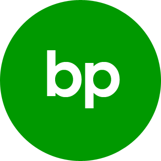
So, let's strip it down – they're BP and they're green: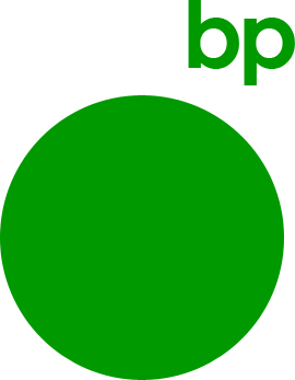

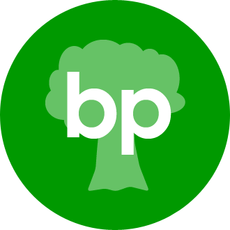
BP: Boring, Pete! Yeah, maybe that's a little too basic. It needs a little pizzazz. How about a tree?
PB: Prehistoric, Baby!
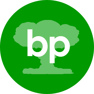
Maybe BP has just taken their self-denial too far. You know what’s cool about oil? It's made from dinosaurs. It's time to go prehistoric on your own asses, BP:
Let's try it with a bit more minimalism. You know what those stegosaurus spikes remind me of – the Helios design of BP's current logo. It's time to cross the streams, Egon...
Mind The Gap: A Re-rebranding
March 26, 2014 — By Dr. PeteBack in 2010, The Gap broke new ground in minimalist redesigns – their reimagined logo was actually so bad that they ditched it after only a week. Neuroscientists have studied (I'm not kidding) why we hated the new logo, but really, just look at it:
![]()
Need new logo for investor meeting. Should be hip and fun. Use one of those web 2.0 fonts (sand sheriffs?). Keep the blue square. Add a gradient " kids love gradients. Have it to me by 5pm!Counting a minute to absorb the email and 5 minutes of banging her head on the desk, that only left our fearless designer 4 minutes to actually do the work. All things considered, it was a heroic effort.
Sadly, the reality is that this rebrand probably took months and cost hundreds of thousands of dollars. Years later, I still feel bad for them, and I don't want them to walk away with nothing. So, The Gap, here's your re-reimagined logo.
What Is "The Gap"?
To really do this project justice (in the 15 minutes I've allotted for it), we have to understand what "the gap" refers to. Is this an actual gap or a metaphorical one? Is it the gap between our perception of beauty and our ability to realize that beauty for $49.99 at the mall? Is it the gap between the garish display of wealth in high fashion and the sweatshop working conditions of garment manufacturers? Is it the gap in my teeth, and do I have spinach in it? No, seriously, could you look?As Freud said, maybe a gap is just a gap. Also, I can't shake the British voice in my head that's saying "Mind the gap." If you're not aware, this is a beautifully understated English way of saying "For the love of God, try not to fall in the crack between the platform and the train, or you'll probably be gruesomely disemboweled, and I'll have to clean that up!"
Minding The Gap
Ok, I looked it up. Apparently, "The Gap" is a reference to the generation gap, but just for fun, let's make it a literal gap. Let's also try one of them sand sheriffs:

Gap, Extreme Edition!
Just one thing bothers me – what if people think the gap is a typographical error? Maybe we need to add something to it, like some water:

Now With More Fonz!
I'd like to thank Will Stevens for pointing out the obvious flaw in this post – how can you introduce a shark and then not jump it? I apologize for this oversight and humbly present one more design:
I think we can all sleep easier now. Thanks again, Will!
Unsolicited Yahoo Logo #31
March 4, 2014 — By Dr. PeteHave you ever finished rebranding your company and thought: "That was so much fun, I wish I could do it 30 times!" That's what Yahoo did last fall, when they released a new logo every day for a month. They finally landed on one of the most underwhelming redesigns of 2013:
![]()
Our last move was to tilt the exclamation point by 9 degrees, just to add a bit of whimsy.I think we can all agree that nothing says –let the good times roll" like a 9° tilt. Like many people, I've spent months thinking I could do better. Unlike most people, I don't have the good sense to ignore that impulse. So, let's get to work...
Yahoo's Brand Message
First, I think we have to distill Yahoo's brand message. If Yahoo could only shout one thing from the rooftop, and if they had just been injected with some kind of truth serum before they climbed up to that roof, I think that message would be:Guys, we're still relevant! Guys?Sorry, Yahoo, but it's time for some tough love – we've kind of forgotten about you. I mean, we know you still exist, but when someone asks "Do you Yahoo?", that person has mostly likely just stepped out of a DeLorean with Doc Brown.
Version 1 – The Question
So, why not own it? Sure, Yahoo's had a few rough years, but you know what we loved about them " they knew how to have fun. It's time to bring the fun back, and the irreverence. Here's my first attempt:
Version 2 – More Questions
Of course, there's an even simpler question, and simplicity is the heart of minimalism:
Your Move, Yahoo.
All of these logos can be yours for the very reasonable price of a year's supply of tacos or a membership to any artisanal cheese-of-the-month club. Ok, I don't really expect Yahoo to embrace these designs, but I just needed to get this off of my chest. If you'd like to see other people take a crack at it, check out this design from a Yahoo intern or the contest winner from 99designs.Home | Who is Dr. Pete? | Are You A Real Doctor? | Can I Hire You? | Archive
©2024 User Effect, LLC.